Overview

Research

Design & Refinement

Doodle Dash

Doodle Dash

PROJECT

Self-directed project

KEY CONTRIBUTIONS

UX Research

Interaction Design

Motion Design

Interaction Design

TOOL

Spline

Adobe Premiere

Adobe CC Suite

Overview

Problem

30-34%

30-34%

of school-aged children struggle to develop the handwriting skills needed to keep up in class.

Traditional workbooks lack step-by-step stroke guidance, while digital apps lack the physical resistance required to build muscle memory. Without constant supervision, children treat letters as graphics, form them incorrectly, and reinforce poor habits over time.
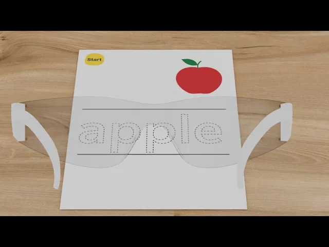
Design Response

Doodle Dash overlays AR guidance onto traditional paper workbooks. Through a headset:

  • Animated arrows guide each stroke in correct order and direction

  • Audio narration from a cartoon character reinforces the lesson

  • Real-time corrective feedback lets children self-correct without adult supervision

  • Story-driven missions with interactive 3D rewards reinforce letter–word–object connections

The Concept Video

Overview

Conceptual Impact

Physical + digital XR interaction

The AR experiences extend tangible activities rather than replicate them on screen.

Translating Theory to AR

Developed a principle-to-feature framework mapping four educational principles into specific, gamified mixed-reality interactions.

End-to-end concept execution

End-to-end concept execution: UX research, interaction design, motion design, and 3D spatial prototyping in Spline.

Research

Competitive Analysis

To understand the current landscape, I examined the tools children use today — traditional workbooks and digital handwriting apps — to surface where each succeeds, where each fails, and how those failures show up in real behaviour.

(Note: No existing AR products address handwriting practice specifically, so the competitive set focuses on the analog and digital tools currently in use.)

Handwriting workbook

Visual-word association:

The illustration demonstrates the alphabet in context

Lack of guidance on stroke sequence and formation

No stroke validation & No error correction

Handwriting workbook

Clear starting points:

Indicate the starting point for forming the alphabet

Story integration

Incomplete guidance for letters requiring multiple strokes

Overly complex scenes:

Illustrations feature distracting elements beyond the alphabet that may confuse learners.

Handwriting practice app

Animated instructions on stroke direction, sequence, and letter formation

Immediate feedback when incorrect letter formation is traced

Weak muscle memory formation:

Digital handwriting on touchscreens limits the development of muscle memory for letter formation

Animated instructions only play once, making it difficult to remember

Research

Contextual Observation

I observed one preschool-age learner using both a traditional workbook and a digital handwriting app, documenting behaviors, expressions, and verbal feedback. While this is not generalizable, it surfaced friction points that competitive analysis alone couldn’t reveal.

#1 Percieve dotted letters as graphics

#1 Percieve dotted letters as graphics

The user connected dots in random, non-standard ways, treating dotted letter outlines as abstract shapes rather than stroke guides.

The user connected dots in random, non-standard ways, treating dotted letter outlines as abstract shapes rather than stroke guides.

#2 Illustration engagement (positive signal)

#2 Illustration engagement (positive signal)

The learner was drawn to illustrations and engaged through coloring and verbal interaction — visual richness sustains attention.

The learner was drawn to illustrations and engaged through coloring and verbal interaction — visual richness sustains attention.

#3 Stroke Direction Guessing

#3 Stroke Direction Guessing

The learner formed letters backwards with no awareness of incorrectness — errors happen and go unnoticed.

The learner formed letters backwards with no awareness of incorrectness — errors happen and go unnoticed.

#4 Digital rushing without resistance

#4 Digital rushing without resistance

On the app, the learner rushed through letter formation without paper's physical resistance — reducing tactile feedback for muscle memory.

On the app, the learner rushed through letter formation without paper's physical resistance — reducing tactile feedback for muscle memory.

How might we help young learners master letter formation with interactive guidance and real-time feedback?

need

user

How might we help young learners master letter formation with interactive guidance and real-time feedback?

Design & Refinement

Features Mapping

The following framework shows how each research insight informed a design principle, which in turn shaped a specific AR feature, ensuring every interaction addresses an observed pain point.

INSIGHT

PRINCIPLE

AR FEATURES

  • #1 Letters perceived as graphics

  • #3 Stroke direction guessing

Guide proper technique

Every interaction must teach correct stroke sequence and direction

  • Step-by-step directional arrows

  • #4 Rushing without resistance

Preserve tactile experience

Maintain pencil-on-paper benefits while adding digital guidance

  • AR overlay on physical paper

  • #3 Stroke direction guessing

Provide immediate feedback

Real-time positive and corrective guidance

  • Green traces for correct strokes

  • Red alerts for errors

  • Celebration animations

  • #2 Illustration engagement

Leverage visual interest

Use engaging & interactive graphics to sustain motivation

  • Gamified story-based missions

Research

Storyboard

To validate the end-to-end flow, I storyboarded a single practice session from a first-person view — testing whether the AR features connect into a coherent learning loop.

Refinement through critique

With the concept mapped out, I stress-tested two specific interactions against my own design principles and feedback from my professor. Each refinement traded a more obvious solution for one that better served the underlying learning goal.

Refinement #1 — Animated Visual Cues

Critique surfaced: Static instructional symbols required cognitive interpretation — a barrier for pre-readers who can't decode abstract indicators.

Critique surfaced: Static instructional symbols required cognitive interpretation — a barrier for pre-readers who can't decode abstract indicators.

Before:

Before:

Static, ambiguous symbols (requiring interpretation)

After:

After:

Animated elements with gradient and fade effects show the intended action—arrows indicate stroke direction and sequence

Refinement #2 — Educational Rewards

Critique surfaced: The apple-catching mini-game was engaging but reinforced no learning. Children associated success with reflexes, not with letter–word–object connection.

Critique surfaced: The apple-catching mini-game was engaging but reinforced no learning. Children associated success with reflexes, not with letter–word–object connection.

Before:

Before:

Disconnected entertainment (catching falling apples)

After:

After:

Learning-integrated reward—children explore an interactive 3D apple while hearing fun facts, strengthening the connection between letter, word, and object concept

Trade-off: The new reward is less immediately exciting than a fast-paced mini-game. I accepted this because the goal is sustained literacy development, not short-term dopamine.

Trade-off: The new reward is less immediately exciting than a fast-paced mini-game. I accepted this because the goal is sustained literacy development, not short-term dopamine.

Animated Visual Cues

Before:

Static, ambiguous symbols (requiring interpretation)

After:

Animated elements with gradient and fade effects show the intended action—arrows indicate stroke direction and sequence

Critique surfaced: Static instructional symbols required cognitive interpretation — a barrier for pre-readers who can't decode abstract indicators.

Educational Rewards

Before:

Disconnected entertainment (catching falling apples)

After:

Learning-integrated reward—children explore an interactive 3D apple while hearing fun facts, strengthening the connection between letter, word, and object concept

Critique surfaced: The apple-catching mini-game was engaging but reinforced no learning. Children associated success with reflexes, not with letter–word–object connection.

Trade-off: The new reward is less immediately exciting than a fast-paced mini-game. I accepted this because the goal is sustained literacy development, not short-term dopamine.

Testing & Iteration

Low-Fidelity Prototype - Testing & Iteration

Refinement through critique

I created a simplified paper prototype and tested it with the user to validate core interactions. This rapid testing phase helped us quickly make changes and get feedback, revealing critical insights for further optimization.

With the concept mapped out, I stress-tested two specific interactions against my own design principles and feedback from my professor. Each refinement traded a more obvious solution for one that better served the underlying learning goal.

PROJECT

Self-directed project

TOOL

Spline, Adobe Premiere, Adobe CC Suite

CONTRIBUTIONS

UX Research

Interaction Design

Motion Design

Interaction Design

Doodle Dash